Key Takeaways
Why Depreciation Charts Matter to Private Sellers
Most private sellers price emotionally. They remember what they paid, subtract a rough guess, and post a number — then spend weeks fielding lowball offers or, worse, getting no offers at all. A depreciation chart replaces the guesswork with a data-backed baseline that prospective buyers can't easily argue away.
A depreciation chart plots a vehicle's estimated market value on the vertical axis against time (usually model years or vehicle age) on the horizontal axis. The resulting curve tells you two essential things: how much value your specific vehicle has already shed, and how quickly it is still declining. Both pieces of information shape a confident asking price.
If you're new to how vehicles lose value over time, the Complete Owner's Introduction to Vehicle Depreciation is a useful starting point before diving into chart mechanics. Likewise, the Depreciation Basics hub gives you a library of supporting articles once you're ready to go deeper.

The chart is not a magic number — it is a starting line. Your car's condition, mileage, accident history, trim level, and even color all adjust that line up or down. The steps below show you how to read the data, apply those adjustments, and land on a defensible price.
What's Actually on a Depreciation Chart
Before you can read a chart, you need to know what the axes and lines represent. Most depreciation charts you'll encounter — whether from Kelley Blue Book, Edmunds, iSeeCars, or similar tools — share a common anatomy.
The Value Axis (Vertical)
This axis shows estimated market value in dollars. You will typically see three distinct value lines plotted on the same chart:
- Dealer retail value: What a dealership lists the car for, usually the highest figure on the chart.
- Private-party value: The price a private seller can realistically expect from a direct buyer — this is the line you care about.
- Trade-in value: What a dealer would pay you, almost always the lowest of the three.
Many sellers accidentally anchor to the retail value because it's the biggest number. Using that figure to price a private-party sale will make your listing uncompetitive from day one.
The Time Axis (Horizontal)
The horizontal axis is usually expressed in model years, vehicle age in years, or both. Some tools let you toggle between calendar year and vehicle age, which affects the shape of the curve depending on when the model was introduced mid-year.
The Curve Shape
The curve itself is the most instructive part. A typical depreciation curve is steep early and flattens over time — mathematically, it behaves like an exponential decay function. For a concrete data picture of this shape across a vehicle's lifetime, see Car Depreciation from Day One to Year Ten, which walks through industry benchmarks year by year.
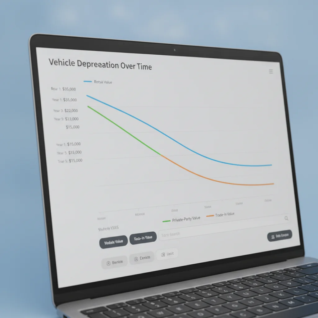
The practical takeaway: if your car is three years old, you are near the steepest part of the slope. If it is seven years old, the curve has flattened considerably, meaning further annual value loss is smaller in dollar terms — though it can still be meaningful as a percentage of remaining value.
Retail Value Will Mislead You
Dealer retail prices include reconditioning costs, dealership overhead, and profit margin — often 10–20% above what a private buyer will pay. If you use the retail line from a depreciation chart to set your private-sale price, your listing will be non-competitive from the moment it goes live. Always verify you are reading the private-party line before writing down any number.
Tools You'll Need
Gathering your data before sitting down with a chart makes the process much faster. Here's what to have ready.
Kelley Blue Book (KBB)
Provides private-party value estimates with condition tiers and a historical value chart for your specific vehicle.
Edmunds True Market Value (TMV)
Offers an independent private-party value estimate and market-based pricing data to cross-check KBB figures.
iSeeCars Depreciation Tool
Displays historical depreciation rates and average listing prices by model year — useful as a third reference point.
CarGurus Local Listings Search
Lets you filter active private-party listings by ZIP code radius so you can compare your chart price to real local competition.
Carfax or AutoCheck Report
Confirms accident history, service records, and ownership count — all of which affect which condition tier applies to your vehicle.
Spreadsheet (Excel or Google Sheets)
Keeps your source values, adjustments, and calculations organized so you can revisit and update your price easily.
What you will need
Step-by-Step: Reading and Applying the Chart
Work through these steps in order. Skipping ahead — particularly jumping to step 6 without completing the adjustments in steps 4 and 5 — is the most common cause of a mispriced listing.
Pull Your Vehicle's Depreciation Data from at Least Two Sources
Open Kelley Blue Book (kbb.com) and Edmunds (edmunds.com) in separate tabs. On each site, navigate to the used-car valuation tool and enter your vehicle's year, make, model, trim, mileage, and ZIP code. Both sites will return a range of values broken down by condition.
Note the private-party value specifically — not trade-in, not dealer retail. Write both numbers down. The gap between the two sources is your first data point: if they agree within $500, you have a reliable baseline. If they differ by more than $1,000, you'll need to investigate why (often it's a trim-level discrepancy or condition definition difference).
Locate the Private-Party Line on the Chart
Most tools display a visual chart alongside their value estimate. On Edmunds, look for the 'Price History' or 'True Market Value' graph. On KBB, a value range bar appears alongside market context data. If a multi-line chart is shown, identify the private-party line — often displayed in blue or a neutral color distinct from the retail line.
Trace the curve backward three to five years to understand the slope. A sharp drop from year one to year three followed by a flatter decline confirms you are looking at a normal depreciation curve. A flat or irregular curve could indicate a specialty vehicle, a supply shortage, or data gaps.
Identify Where Your Vehicle Sits on the Curve
Find your vehicle's current age on the horizontal axis. Mark that point on the private-party line. The dollar value at that intersection is the chart's baseline estimate for a vehicle of your year, make, and model under average conditions.
For example: if you own a four-year-old midsize sedan and the private-party line at the four-year mark shows $18,500, that is your starting number before any adjustments.
Apply the Mileage Adjustment
The chart baseline assumes average annual mileage (typically 12,000–15,000 miles/year in the U.S.). Calculate your car's expected mileage: multiply its age in years by 13,500 (a reasonable national average). Compare that to your actual odometer reading.
- If your mileage is lower than expected: Enter your actual mileage into the tool and observe the adjusted value — many tools will increase the estimate, sometimes by $500–$2,000 depending on the gap.
- If your mileage is higher than expected: Enter your actual mileage and note the reduction. High-mileage penalties are steeper in the first five years and soften as a car ages.
Record the mileage-adjusted private-party value as your new working number.
Apply the Condition Adjustment
Valuation tools define condition in tiers: Excellent, Very Good, Good, Fair, and Poor (labels vary by tool). Each tier carries a dollar adjustment — typically a spread of 15–25% from top to bottom across all tiers.
Be honest, not optimistic. Most private sellers rate their car one tier higher than a neutral observer would. Use this rough guide:
- Excellent: No mechanical issues, minimal cosmetic wear, service records intact, no accidents.
- Very Good: Minor cosmetic issues (small dings, light scratches), mechanically sound, possibly one prior accident with clean repair.
- Good: Noticeable cosmetic wear, all major systems functional, may lack service records.
- Fair: Visible damage, mechanical issues present, needs imminent work.
Select the appropriate tier and note the tool's adjusted value. If both KBB and Edmunds support condition-tier selection, record both adjusted figures.
Average Your Sources and Define Your Price Range
You now have two condition-and-mileage-adjusted private-party figures — one from KBB and one from Edmunds. Average them to get a single market-consensus estimate. Then define a range: set the low end at 3% below the average and the high end at 8% above it.
Example: KBB adjusted = $17,200; Edmunds adjusted = $16,800. Average = $17,000. Range: $16,490 (low) to $18,360 (high).
This range is your defensible asking-price window. Where within that window you ultimately price depends on condition, urgency, and local market conditions — addressed in the final section below.
For a deeper walkthrough of the math behind this calculation, Calculating Your Car's Depreciation: A Practical Walkthrough shows the formulas step by step.
Check Local Comparable Listings to Validate the Chart
A depreciation chart reflects national averages. Before finalizing your price, search for active private-party listings within 100 miles of your ZIP code for the same year, make, model, and trim. Focus on listings that have been active for fewer than two weeks — older listings may be overpriced and stale.
If local comps cluster above your chart-derived range, you may be able to push your asking price higher. If they cluster below, the national chart is likely not reflecting local supply conditions, and you should price toward the lower half of your range to compete.
Once you have a final adjusted price from the steps above, the Calculating Your Car's Depreciated Value Before You List It article walks through the underlying math in greater detail, which is useful if you want to double-check your logic before publishing.
Common Misreads and How to Avoid Them
Even after you understand the chart's structure, a few interpretation errors are extremely common. Recognizing them in advance will save you time and negotiating headaches.
Misread 1: Treating the Chart as a Ceiling, Not a Baseline
The private-party line on a depreciation chart reflects typical market conditions for an average vehicle in average condition. If your car is in exceptional condition with below-average mileage and no accident history, you have a legitimate case for pricing above the charted line — not just at it. Conversely, treating the line as a ceiling when your car has high mileage or paint damage means you'll still overprice it.
Misread 2: Ignoring the Chart's Mileage Assumption
Valuation tools build their curves around an assumed annual mileage, typically 12,000–15,000 miles per year in the U.S. If your five-year-old car has 95,000 miles instead of 60,000, the chart value is overstating what buyers will pay. Most tools let you enter actual mileage and will adjust the output — use that feature every time.
Misread 3: Comparing Across Different Value Types
One tool might display trade-in value by default while another opens to retail. Always confirm which value type you are looking at before noting a number. Mixing a retail figure from one source with a private-party figure from another produces a meaningless average.
Misread 4: Using National Data for a Regional Market
Depreciation charts reflect national averages. A pickup truck in a rural state or a convertible in the Sun Belt may command noticeably more than the national curve suggests. Checking local listings on Marketplace, Craigslist, or AutoTrader for comparable vehicles gives you a regional reality check.
Use the 'Days on Market' Filter When Checking Comps
When researching local listings, filter for vehicles listed within the past 14 days. Cars that have been sitting for 30+ days are almost certainly overpriced for that market. Freshly listed comps give you a far more accurate picture of what buyers are actually willing to pay right now.
Revisit the Chart If You Don't Sell Within 30 Days
Depreciation doesn't pause while your car sits on the market. If you haven't received serious offers within 30 days, pull fresh valuations from your tools — the numbers may have shifted, especially for newer models with fast-moving market prices. A small price correction early beats a large one later.
For a full audit of all the factors that push your car's value above or below the chart baseline, see Key Depreciation Factors Every Seller Should Audit Before Setting a Price. It covers trim, color, accident history, and supply dynamics in one place.
Accident History Changes Everything
A prior accident on your vehicle's Carfax report is not a cosmetic adjustment — it is a structural data point that buyers treat as a major risk factor. Even a clean repair can reduce buyer willingness to pay by 10–25% compared to the chart baseline. If your car has a reported accident, price accordingly from the start rather than waiting for buyers to use it as a negotiating weapon after they've already invested time in inspecting the vehicle.
Turning the Chart Into Your Final Asking Price
By the time you finish the steps above, you'll have a private-party value range — likely a spread of $500 to $1,500 depending on how closely the tools agree. Here's how to convert that range into a single listing price.
Choose a Position Within the Range
If your car is in excellent condition with service records and low mileage relative to its age, price toward the top of the range. If it has cosmetic wear, higher mileage, or a prior accident on record, price toward the middle or low end to attract buyers quickly rather than sitting on the market.
Build in a Negotiating Buffer
Private buyers almost always negotiate. Pricing 5–8% above your true floor gives you room to let a buyer feel like they won something without you accepting less than you need. On a $12,000 car, that's a $600–$960 buffer — reasonable and expected.
Set a Time Horizon
Depreciation continues while your car sits unsold. A car losing $200 per month in value costs you real money for every week you hold out for a higher price. Decide in advance how long you are willing to wait; if you pass that deadline without an offer, a price reduction is often smarter than continued waiting.
Understanding how depreciation data can also work in your favor as a negotiator — not just as a seller — is covered in Using Depreciation Data to Negotiate a Better Car Price. If you plan to roll proceeds into a purchase, that guide is worth reading next.
And if you want to understand how the valuation reports from KBB and Edmunds are structured more broadly, Reading a Valuation Report: A First-Timer's Walkthrough provides a section-by-section breakdown that complements what you've learned here.

Pricing from a depreciation chart isn't about squeezing every last dollar from a transaction — it's about entering that transaction with clear, documented reasoning that holds up when a buyer pushes back. That confidence is the real output of this process.

All claims are backed by peer-reviewed research. Sources on request.